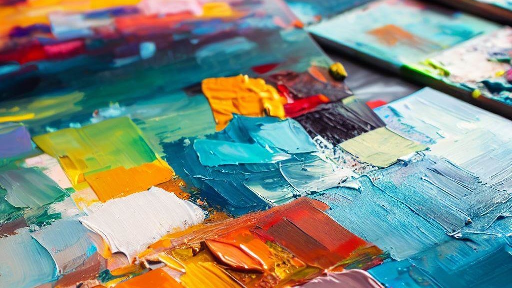
Color is one of the most important elements of art. It can create mood, contrast, harmony, and emphasis. It can also convey meaning and symbolism. In this blog post, we will explore some of the ways that color can affect the perception and interpretation of art.
Create mood
One of the main functions of color in art is to create mood. Mood is the feeling or atmosphere that a work of art evokes in the viewer. Different colors can have different psychological effects on people, depending on their cultural and personal associations. For example, red can be associated with passion, anger, or danger; blue can be associated with calmness, sadness, or coldness; yellow can be associated with happiness, optimism, or caution; and so on. Artists can use color to create a specific mood in their work, or to contrast different moods within a composition.

Create contrast
Another function of color in art is to create contrast. Contrast is the difference between light and dark, warm and cool, or complementary colors. Contrast can help to create focal points, highlight important features, or add drama and interest to a work of art. For example, a bright red object against a dark background can draw attention and create a sense of urgency; a warm orange color against a cool blue color can create a sense of warmth and energy; a purple color against a green color can create a sense of tension and balance.
Create harmony
A third function of color in art is to create harmony. Harmony is the pleasing combination of colors that creates a sense of order and unity. Harmony can be achieved by using colors that are similar in hue, value, or saturation; by using colors that are adjacent on the color wheel; or by using colors that are derived from a single hue. For example, a monochromatic scheme uses different shades or tints of one color; an analogous scheme uses colors that are next to each other on the color wheel; and a triadic scheme uses colors that are evenly spaced on the color wheel.
Create emphasis
A fourth function of color in art is to create emphasis. Emphasis is the way of making certain elements stand out or attract attention in a work of art. Emphasis can be achieved by using colors that are different from the rest of the composition; by using colors that are more intense or saturated; or by using colors that have symbolic or emotional significance. For example, a black and white image with a splash of red can create a strong visual impact; a bright yellow color can create a sense of excitement or happiness; a white color can create a sense of purity or innocence.
Color is a powerful tool for artists to express their ideas and emotions. By understanding the role of color in art, we can appreciate the beauty and diversity of artistic creations.

Leave a comment